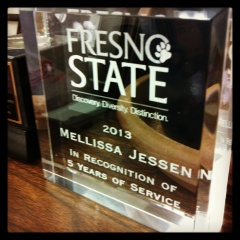
 I recently celebrated my fifth anniversary at my workplace. This was quite a feat, as I’ve never worked anywhere that long – I also never planned to stay at my job past five years. And here I am, loving my work so much, I can’t imagine leaving. To learn more about this work, check out this new page.
Over the past five years, I seemed to become known as the office go-to person for emerging technologies including social media. I’m not sure how this happened. It might have been my age – I’m on the tail end of Generation X and thusly have had more experience with technology in earlier stages of my life – as compared to my coworkers. Ultimately, however, I think it’s my general love for new technologies (as discussed here), and specifically, how we can use them to our benefit in the higher education sector.
For quite some time, I’ve been drooling over infographics (check out Cool Infographics to view multiple samples). Infographics share data and knowledge in a quick and visually pleasing way. Unfortunately, unlike my graphic designer husband, I am not trained in advanced programs (I’m specifically thinking about the Adobe suite) and cannot create an infographic on my own.
Enter online programs and apps that cater to such wannabes as myself. If I ever needed to create and distribute a high quality infographic to a large constituency, I would consider working with a graphic designer. However, in the interim, there are a plethora of programs available to make using infographics easy for the layman.
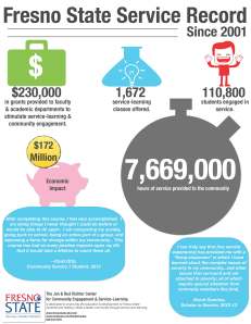
I did a little research of my own, and settled on Grafio, an app for iOS. I downloaded the free version to my iPad (though, I ultimately installed the paid version after playing around awhile and deciding that this was the app for me). Grafio allowed me to not only create an infographic, but print one – which was something I was looking for.
 My boss asked me to prepare something that he could use at a meeting to share some valuable statistics. I’m proud to share this data with you on the little infographic (to the left) I designed for him. What do you think of my first try?
I’m looking forward to integrating what I’ve learned from this project into my classroom. This will be a great way to share information with students. However, I think this would also make for an interesting assignment for students. Because there are so many free infographic tools out there, it would be easy enough to incorporate into an assignment and it would be a great skill for the students to learn. I would love to see how creatively the students can visually represent or interpret basic data.
So, what do you think? Do you use infographics for anything? Are there any programs out there that you recommend?
